
Logos are an ever more important component of modern branding as attention spans get ever shorter. When seconds count distinctive logos can be critical for successful brand recognition.
The first contemporary commercial logo, The Bass Brewery’s red triangle was trademarked nearly one-hundred-fifty years ago. Since then, countless new ones, be they good, bad, or just ugly, have populated the printed page and computer screen.
Last week Michael Nicholson, DesignHammer’s newest employee, inquired as to the symbolism of the company’s logo. A number of us shared our thoughts behind the meaning of our iconic cube. Frank Yonnetti deserves credit for designing a logo which could inspire so many creative responses.
The Black Box: Michael Nicholson

I like the idea that one of our ‘guiding principles’ is openness in the development process, rather than taking a specification and handing back a product without any other communication. We certainly seem to invite a lot of client participation and discussion in the process. I think this helps us in a variety of ways, including delivering a final product more in line with client desires/needs, helping shape the client expectations in cases where their desires may not address their needs, giving client authority and responsibility for certain decisions, and allowing bidirectional flexibility when necessary.
The Taco: Jay Roberts

It’s a stylized taco representing how good web development is a mix of many ingredients, and tastes good.
![]()
The Monolith: David Minton

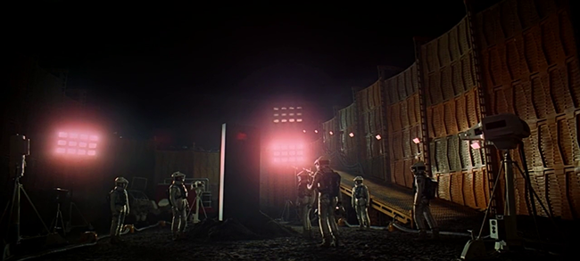
From the opening of Stanley Kubrick's groundbreaking adaptation of Arthur C. Clarke's seminal 2001: A Space Odyssey, in which the alien Monolith appears before a group of australopithecus in Olduvai Gorge, through the radio burst directed at Jupiter (Saturn in the novel) by the lunar situated Tycho Magnetic Anomaly-1 (TMA-1), the near impossibly advanced "Firstborn" use advanced technology to steer human development, and literally lead us to the stars.
DesignHammer's logo represents the partially excavated Tycho Magnetic Anomaly-1 berried in the lunar soil (from a reverse angle with the retaining wall in the foreground), ready to release a burst of advanced technology and creativity to propel our clients toward achieving their goals by overcoming their obstacles.
Covered Box: Amanda Hart

A simple box and a simple covering, representing a wide variety of possible projects and clients. No matter what kind of project it is, DesignHammer is able to find the correct fit. Your box can be Drupal, WordPress, or even completely custom. You might already have an existing site and need a new box; we can make your covering work.
The box is the backend server, platform, and code. The covering is the user interface and user experience. Together, they are DesignHammer.
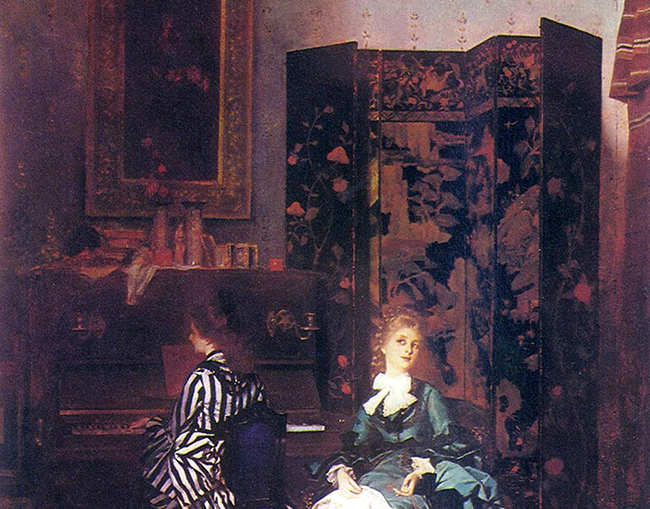
The Folding Screen: David Gouch

A little privacy, please. The DesignHammer logo is clearly a folding dressing screen behind which an excited website is trying on a whole new look. We’re talking new colors, a fancy new font — and I even heard the DesignHammer stylist suggest switching the sidebar part to the other side. It’s going to be stunning.
And, of course, the whole ensemble will flow well on mobile. Because no one should be caught dead sporting the pinch-to-zoom look these days. Total iFaux pas.
In the end, the DesignHammer logo’s simple folding screen doesn’t draw attention to itself. Instead, it makes you anticipate the work behind the curtain that’s about to be revealed: Another lucky website getting its moment to shine in the spotlight.
The Opening Box: Stephen Pashby

A closed box that is opening. The logo signified finding hidden answers inside the box.
In working with our clients, we are often asked to make a thing, “the box.” This may be a website, an app, or a more unique solution. Seldom have our clients already assembled the necessary information for anyone to correctly build the box they need.
Some firms will simply look at the box on the surface and build what they can see. This risks missing the hidden depths of what the client actually needs.
Using our repeatable process, we work with our clients to help open the box and learn what they really need and desire. Through this collaboration, we and our clients are successful.
The Box and background: Jeanette Larsen

To me this logo has two different parts, a box or cube in the background and then an open cover in the foreground.I think the box in the back is representing a computer or a website. The cover in front represents the theme or design. It looks as though it is being placed in front, rather than attached. This space allows for the freedom to be designed and changed as needed.
![]()
What does the DesignHammer logo mean to you? Share your interpretation in the comments below, or email us to learn the official answer.
Comments
This is very Nice
This is very Nice
Add new comment