
While browsing the other day I came across an interesting article from the wonderful folks at AIGA, the professional association for design, about a far too often overlooked aspect of UI/UXl. The title of the article seems very straightforward: How Can Designers Build Interfaces That Avoid the “White Default?” I agree that this question is important and the answers can be subtle in their underlying complexity but let’s rewind: what is a “white default”?
I think it’s helpful to consider that a default is what we refer to as the automatically preselected option for a program or system. Also when we talk about programming there exist “whitelists” or a list of things that are still recognized when everything is denied by default.
Simply put, it’s the idea that many of our services, products, and spaces are designed with base assumptions that users will conform to certain assumptions about their demographic information. More specifically, at least in the United States, they're likely to be white and English speaking, identify with the gender binary, and likely have a name that can easily entered or modified to fit within our social expectations.
The obvious question then, is why don’t we identify the assumptions being made and eliminate them at the start of the process? The answer is simple: we frequently don’t realize that we’re making assumptions to begin with.
In thinking about how I wanted to approach this post I spoke with my friend Alexander, a fellow minority who’s worked in the tech industry for over a decade now. At some point the topic of facial recognition came up and I asked if he had ever noticed that sometimes more melanated faces don’t get picked up, necessitating extra care when, say, choosing a Zoom background, or rendering some of the more entertaining filter options on popular social networking apps functionally useless.
His response was very striking in its earnesty: “well don’t cameras just have a harder time picking up color in certain spectrums”? While that may be part of the problem, another is likely in the software itself. According to an IBM review reported in Wired,
“The easiest place to gather huge collections of faces is from the web, where content skews white, male, and western. Three face-image collections most widely cited in academic studies are 81 percent or more people with lighter skin.”
Essentially the face recognition software isn’t exposed to a large and diverse enough pool of non-white faces to develop an algorithm effective for all users. In other words, much software is designed and tested assuming the users will fit within a “white default.”
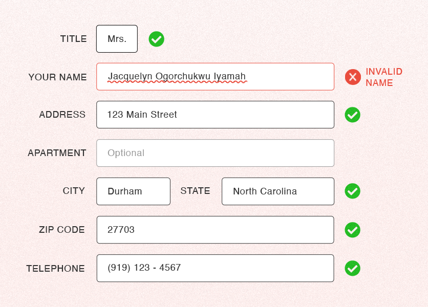
In looking further into this question of the existence of “white default” I happened to have a conversation with a different friend who’s also been working in the industry for many years. She mentioned that getting her teams to consistently use her proper name was a problem. Beyond wanting to be called by the proper name she was given rather than an anglicized nickname, she even once missed a major conference because the internal system for booking tickets couldn’t match the name on her government issued ID.
To give an easily relatable example of how “white default” relates to poor website usability for some users, we can look at the problem my friend encountered with her plane ticket. Most likely there was an error in the way the system dealt with names. We likely encounter data forms every day that rely on “white default” but don’t notice them if we fall within what the system designers envisioned as “normal.”
For example I am an American with the usual allocation of three names (Given name, Middle name, Family name), all of reasonably short length (six characters each), but, what if my family name was twenty-five characters long and the database truncated any name longer than twenty characters? We want all of the users to be on the whitelist for relatively simple things.
Others have written about the ways we make problematic assumptions when it comes to constructing seemingly simple forms. You may have even had conversations yourself about the extent to which designing inclusive systems is even necessary for your projects. What is the cost/benefit of building more inclusive systems? I’d say that it’s the way that we can really empower our users, customers, and even employees to show up as authentically as possible.
In attempting to build our products and systems without built-in assumptions beyond “everyone that shows up should be able to use this easily” we can reach a greater audience and provide better value. Whether that’s as simple as learning how to pronounce a name and making sure that said name can be entered, stored and displayed accurately, or involves a little more elbow grease during the planning phase, everyone wins overall. Forethought can help us avoid unnecessary mistakes that in turn present problems for our users.
This is certainly an ongoing discussion but I leave you with a question from another colleague about their experience with a form: Do you really want part of my sign-up experience to be that you tell me that my name is invalid? Do you want to have to backtrack and rebuild or patch a system when you can start with a conversation about designing the project properly from the beginning for the benefit of all potential stakeholders and users? Acknowledging that we can do better is the first step to what we are all called to do: Be better.