Creating a website takes a lot of work, including figuring out how you want it to look. An aesthetically pleasing website has a significantly lower bounce rate and yields noticeably better Search Engine Results Page (SERP) performance.
How do you accomplish this? DesignHammer believes the critical first step in any project is an initial discovery process to form a vision for the site. An outcome of discovery will be to inform the creative direction a designer will take as they begin to build out the core elements of design - wireframes and design comprehensives.
Wireframe vs. Design Comps
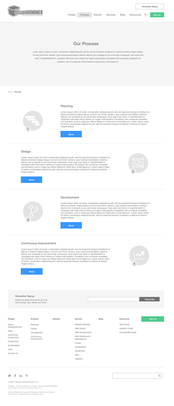
Think of a wireframe as the first building block of creating a website. They are used to define the basic structure of a site’s design, like a blueprint. It’s a very simple black-and-white schematic overview of a page’s main components and structure. The Interaction Design Foundation notes that, “good wireframes are skeletons for powerful prototypes & delightful designs”.
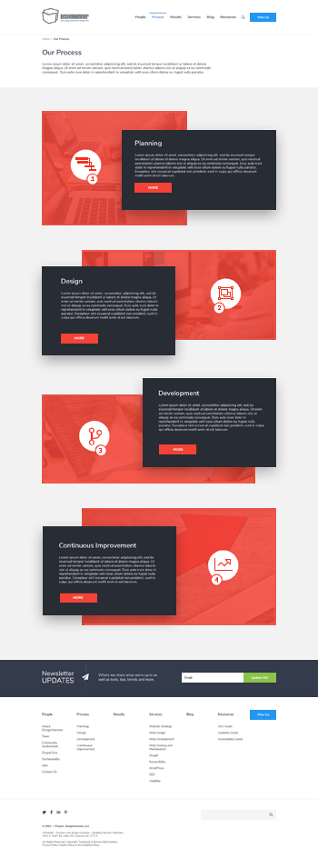
A design comprehensive, or comp, is the next phase after a wireframe. During this phase we take the time to polish up the wireframe, add color, images, and details; showcase the elements that will make the website aesthetically pleasing to your visitors. Now the client can clearly envision the general look and feel of the website and offer any suggestions or changes before development begins.
Wireframes and design comps are like checkpoints to ensure that we are on the same page as the client and meeting expectations for attractive, yet functional design that helps achieve the site's intended goals.


Wireframes vs. Design Comps
It Starts with a Sketch
At DesignHammer, we start the design process by listening to your vision and discovering your needs. Why do you want a new website? What do you like and dislike about your current website? Who is your target audience? What other websites do you like? What features, functions, and styles from them appeal or do not appeal to you? From there it is determined how many wireframes are needed. We typically recommend the homepage and 3-4 subpages, or other key landing pages.
One other critical aspect of the design process to consider with the client is accessibility. This article written by our own Stephen Pashby and David Minton, delves nicely into what accessibility is, why it’s important, and the best resources to use to make sure that you have the most accessible website possible.
Then, typically, wireframes are first sketched out with pencil and paper to give us an idea of the very basic layout before moving to the computer screen. I like to look for what’s popular in web design on Pinterest or Dribbble to get ideas for, for example, navigation or image placement. Once I have an idea, then this is where the magic happens. I prefer to use the digital design app Sketch to create my wireframes. Once the initial wireframes are completed, it is sent off to the client for review. Our project team works with the client on an agreed-upon number of revisions, 1-2 rounds of revisions are typical, before finalizing the wireframes. After wireframes are approved, the client can decide whether to move onto the design comp phase, or do user testing before proceeding.
User Testing? Why Do It?
User testing, or usability testing, is done to determine how easy and efficient it is to use your new site, and how effective the user experience is. It’s important that users can determine the website’s purpose. It’s also important that the site's user experience is intuitive, easily navigable, and that content is organized and presented in a way that makes it easy for users to find what they need. Consider these Essential UX Statistics:
- 88% of online shoppers say they would not return to a website after a bad user experience.
- 70% of online businesses that fail, do so because of poor usability.
- Better UI can increase your conversions by 200%.
- Better UX can increase conversions by 400%, but by contrast 44% of customers will report a poor user experience to their friends.
- You are 279.64 times more likely to climb Mt. Everest, survive a plane crash, or win the lottery than to click on a banner ad.
70% of online businesses that fail, do so because of poor usability
Once an initial wireframe is complete you can use Figma, or a similar app, to prototype your site and start testing. There are many different ways to go about testing but a common method we find to be particularly useful is moderated in-home testing. It’s very important for the moderator to have a script, i.e. a list of certain tasks for the tester to perform that someone would commonly need to do on that website. This way we can time the testers and see how long on average it takes to complete the tasks, and whether the tasks are easy to complete.
The results of this testing are extremely beneficial because fresh eyes can reveal problems that someone who has been designing and examining the pages for hours may have overlooked. Remember, the point of this is to improve the user’s experience, and able to pivot where necessary. It’s much easier (and cheaper) to identify and fix a problem here than when development has begun.
Making the Site Come to Life
So the wireframes are complete, user testing is over, and it is now time to move onto the final and most exciting stage of design - the comps. This is when the company’s branding kit is important and comes into play. As mentioned earlier, we are thoroughly polishing up the wireframes by adding color, images, and basically every last detail to mimic what you would be seeing if the website was live. It is good to remember though that these are still just images, they still have to be converted into a real working environment. There may be some discrepancies between the comps and the final website, but they will be minimal.
Once design comps have been finished and approved, the client can once again decide whether to do another round of user testing, or officially complete the design process and begin development of the new website.
Tying It All Together
Next to Discovery, the Design stage of a website project helps chart the course for how your virtual front door will be received by your intended audiences. DesignHammer believes that websites are best used as tools to help organizations solve business problems. Having an engaging, thoughtful, and well-designed user experience is a critical component to helping you achieve your organizational goals.


Add new comment