


In honor of DesignHammer’s 20th Anniversary, we thought it would be neat to ask the DesignHammer team what they thought the DesignHammer logo represented. For this fun thought experiment, staff members were asked to analyze various parts of the logo including the block/box graphic, the name “DesignHammer”, and if they had any thoughts around the typography and brand colors that they’d like to share.
Here's what the staff had to say about the DesignHammer "block":
“The DesignHammer logo has always reminded me to think outside the box. Why continue to stick to what you know when there's always so much more out there you can use to learn and grow? That's why DesignHammer has been able to stay in business for so long, they're all about growth and working outside the box.”
— Madelyn Yonnetti, Graphic Designer
“It’s a stylized taco representing how good web development is a mix of many ingredients and tastes good.”
![]()
— Jay Roberts, Lead Developer
“A closed box that is opening. The logo signified finding hidden answers inside the box.”
“In working with our clients, we are often asked to make a thing, “the box.” This may be a website, an app, or a more unique solution. Seldom have our clients already assembled the necessary information for anyone to correctly build the box they need. Some firms will simply look at the box on the surface and build what they can see. This risks missing the hidden depths of what the client actually needs. Using our repeatable process, we work with our clients to help open the box and learn what they really need and desire. Through this collaboration, we and our clients are successful.”
— Stephen Pashby, Account Manager
“The smaller, foreground piece looks like a book or magazine that the figure behind (perhaps a person's head) is reading/studying; it kind-of suggests that DH is always learning and has their finger on the pulse of current tech and trends.”
![]()
“As far as color goes, it hints that there are some Duke and Carolina fans/grads at DH (it's no surprise that this NCSU grad would notice the lack of red!). The tagline goes hand-in-hand with the company name in suggesting that we have the tools and skills to create great products. The logo graphic + name (entire logo) somewhat resembles a hammer (the graphic being the head of the hammer and the name being the handle), which is a neat touch.”
— Tiffany Cissel, Developer
“Two things—one that we like to think outside of the box for our clients, and secondly that we realize that while the 'front page' is important and makes an impact for the client, it's the layers that live beyond that are truly important to the success of a site.”
— Dave Shepley, Development Strategist
“From the opening of Stanley Kubrick's groundbreaking adaptation of Arthur C. Clarke's seminal 2001: A Space Odyssey, in which the alien Monolith appears before a group of australopithecus in Olduvai Gorge, through the radio burst directed at Jupiter (Saturn in the novel) by the lunar situated Tycho Magnetic Anomaly-1 (TMA-1), the near impossibly advanced "Firstborn" use advanced technology to steer human development, and literally lead us to the stars. DesignHammer's logo represents the partially excavated Tycho Magnetic Anomaly-1 buried in the lunar soil (from a reverse angle with the retaining wall in the foreground), ready to release a burst of advanced technology and creativity to propel our clients toward achieving their goals through overcoming their obstacles.”
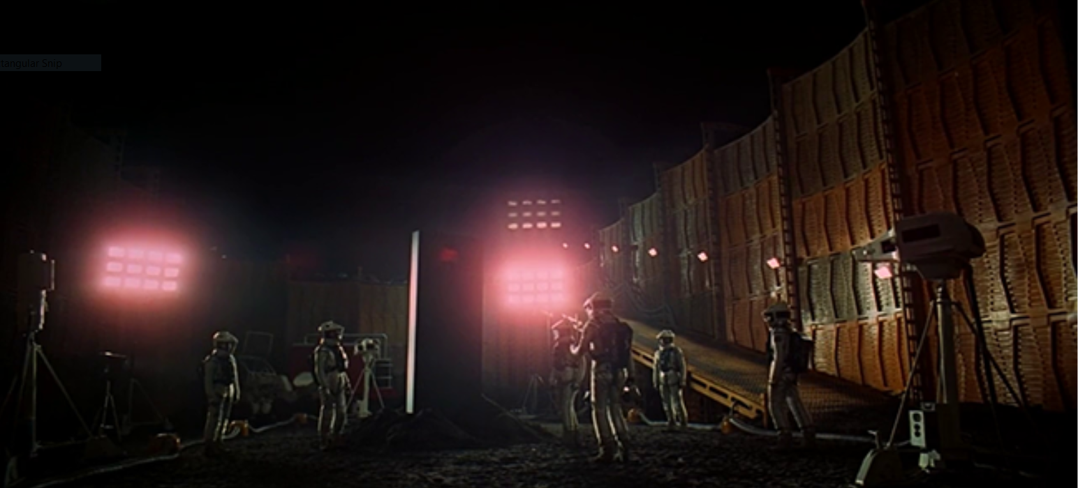
— David Minton, Managing Partner
“I like the idea that one of our ‘guiding principles’ is openness in the development process, rather than taking a specification and handing back a product without any other communication. We certainly seem to invite a lot of client participation and discussion in the process. I think this helps us in a variety of ways, including delivering a final product more in line with client desires/needs, helping shape the client expectations in cases where their desires may not address their needs, giving client authority and responsibility for certain decisions, and allowing bidirectional flexibility when necessary.”
— Michael Nicholson, Project Manager
“When I started at DesignHammer, my first impression of the DesignHammer box logo was that it must be related to thinking “outside of the box”, but that interpretation seems too easy for this question, particularly because boxes can represent so many things. In dreams, for example, boxes typically tend to symbolize concealment. Under this definition then the DesignHammer box may represent hidden secrets. The front of the box appearing to “open”, however, may mean we’re open to revealing our trade secrets and the hidden talents of our staff members to our clients. So, final answer, the DesignHammer "open box" logo symbolizes that we are ready to share our agency's collective knowledge with anyone who's willing to listen"
— Hunter Deschepper, Account Manager
“It's cliché but I'm going with one of these: "thinking outside the box, thinking out of the box, thinking beyond the box, or thinking outside the square.”
— Frank Yonnetti [Original Logo Designer], Partner & Lead Designer